Good Vibes vs Treeworks Packaging and Bottle Appeal
Good Vibes packaging is designed to stand out with bold visuals, a clean bottle shape, and clear, confident branding. Its shelf-ready presentation and thoughtful bottle design make it easy to recognize and appealing at first glance, especially for shoppers who value modern style and brand presence.
You can spot it instantly when shopping for THC syrup. Some bottles grab your attention right away, while others fade into the background before you even read the label. When packaging doesn’t feel intentional or visually clear, it creates hesitation instead of confidence, especially for buyers who rely on first impressions to guide their choices.
According to The Impact of Visual Elements of Packaging Design on Purchase Intention, published by MDPI’s Behavioral Sciences journal, a well-known peer-reviewed research publisher focused on consumer behavior and design psychology, visual elements such as color, layout, and overall bottle design directly influence how consumers perceive quality and decide whether to purchase. The study shows that packaging visuals often shape buying decisions before product details are fully considered.
This means packaging isn’t just about holding the product. It actively shapes trust, brand perception, and confidence in the moment of choice. When packaging can influence decisions in seconds, how much does bottle design really matter when choosing between THC syrup brands?
Why does packaging matter when comparing Good Vibes vs Treeworks?

When shoppers compare Good Vibes and Treeworks, packaging is often the first thing they notice, long before they read labels or product details. Bottle shape, color choices, and overall presentation create an immediate impression that helps people quickly understand what a brand represents. In a crowded THC syrup category, packaging acts as a visual shortcut, signaling style, personality, and attention to detail in just a few seconds.
Looking at Good Vibes and Treeworks side by side, bottle appeal becomes part of how shoppers orient themselves during the comparison process. Clear branding, recognizable design elements, and a shelf-ready look can make it easier to identify a product and feel comfortable picking it up. Packaging doesn’t make the decision on its own, but it often sets the tone for how each brand is perceived at first glance.
Because many buying decisions begin visually, packaging plays a key role in shaping those early impressions. That’s why bottle design and presentation matter when evaluating Good Vibes vs Treeworks, especially for shoppers who value clarity, style, and brand presence.
How does Good Vibes packaging create a strong first impression?
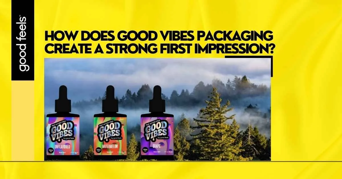
Good Vibes packaging is designed to be instantly recognizable. From the moment you see the bottle, the bold visuals and clean layout communicate a clear sense of identity. The design feels intentional, with branding elements that are easy to spot and remember, even in a busy retail or online setting.
The bottle shape adds to that first impression. It looks polished and shelf-ready, making it feel like a product that belongs front and center rather than blending in. Clear labeling and balanced spacing help the bottle feel approachable and organized, allowing shoppers to quickly understand what they’re looking at without confusion.
Together, these details create a presentation that feels confident and modern. Good Vibes packaging doesn’t rely on explanation to make an impact, it visually speaks for itself. That strong first impression helps build familiarity and trust before a shopper even picks up the bottle.
How does Treeworks approach packaging and bottle presentation?
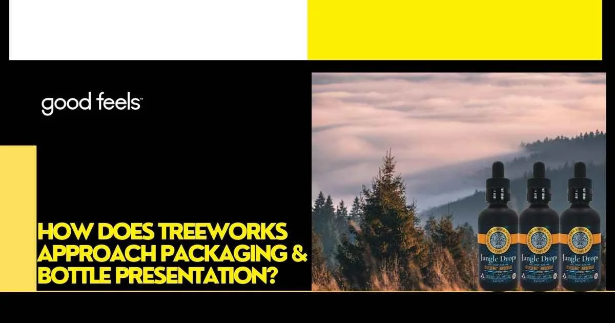
Treeworks packaging reflects a more understated and straightforward design approach. The bottle presentation emphasizes simplicity, with a clean layout and restrained visual elements that give the brand a grounded, crafted feel. Rather than relying on bold graphics, the design focuses on balance and minimal detail to create a calm, uncluttered look.
The bottle shape and labeling work together to present the product clearly and neatly. Information is placed in a way that feels organized and easy to follow, helping the packaging feel intentional without being visually busy. This approach positions Treeworks as a brand that values clarity and a composed presentation.
Overall, Treeworks’ packaging communicates a distinct visual identity through subtlety and consistency. Its bottle design and presentation appeal to shoppers who prefer a more reserved aesthetic and a packaging style that feels simple and deliberate when viewed alongside other THC syrup options.
What are the key visual differences between Good Vibes and Treeworks bottles?

What should shoppers look for in a THC syrup packaging comparison?

To compare THC syrup packaging effectively, shoppers can focus on several visual and practical details that influence first impressions and overall comfort with a brand:
Label clarity: Text that is easy to read, well-sized, and clearly organized helps shoppers quickly understand what they’re looking at.
Information layout: Packaging that separates branding from product details can feel more approachable and less overwhelming.
Ease of recognition: Distinct colors, consistent branding elements, and a familiar bottle shape make it easier to recognize the product later.
Visual balance: Clean spacing and thoughtful alignment can make packaging feel intentional rather than crowded.
Shelf presence: Bottles that stand upright, look polished, and photograph well often stand out more naturally in both retail and online settings.
Brand consistency: Packaging that matches a brand’s overall look across products can feel more reliable and easier to trust visually.
Approachability: A design that feels straightforward and visually clear can help shoppers feel more comfortable picking it up for the first time.
Reviewing how Good Vibes and Treeworks handle these elements side by side can help shoppers decide which packaging style aligns best with their personal preferences and visual expectations.
Turning First Impressions Into Confident Choices
Packaging often sets the tone for how a THC syrup is experienced long before the bottle is opened. As this comparison shows, bottle shape, label clarity, and overall presentation play a meaningful role in how shoppers perceive a brand at first glance. Looking at Good Vibes and Treeworks side by side highlights how different design choices can communicate style, personality, and approachability in distinct ways. The key takeaway is simple: packaging is not just a detail, it’s part of how confidence and familiarity are built during the buying process.
For shoppers who value bold visuals, clear branding, and strong shelf presence, Good Vibes packaging offers a look that feels modern and easy to recognize. Taking a moment to evaluate packaging thoughtfully can help turn browsing into a more confident choice. If you’re ready to explore Good Vibes firsthand, you can find it available through the Good Feels Store, where design, presentation, and product experience come together in one place.
FAQs
What is the main difference in the Good Vibes vs Treeworks packaging?
The key difference in good vibes vs treeworks packaging comes down to design priorities. Good Vibes leans toward bold branding and modern shelf appeal, while Treeworks focuses on a more minimal, craft-style look that emphasizes simplicity.
How does the Good Vibes vs Treeworks bottle design compare?
When comparing the good vibes vs treeworks bottle, Good Vibes typically stands out with a more eye-catching bottle shape and label design. Treeworks bottles feel understated and clean, appealing to consumers who prefer a low-key aesthetic.
Which brand offers better usability in this THC syrup packaging comparison?
In a thc syrup packaging comparison, usability often depends on bottle grip, pour control, and labeling clarity. Both brands aim for practical designs, but some consumers may prefer bottles that are easier to handle and visually guide serving use.
Which THC syrup has better packaging for first-time buyers?
If you’re wondering which thc syrup has better packaging, first-time buyers often gravitate toward bottles that are visually clear, well-labeled, and confidence-inspiring on the shelf. Packaging that communicates quality and brand identity clearly can make a strong first impression.